The Challenge
The Amigo team have highlighted the fact as they expect that the number of people travelling will grow faster than before. So the travel industry is a good place, and it has plenty of room to grow and improve.
For this reason, Amigo needs to expand its range of products and services. In addition to establishing strategic alliances with companies to increase their services.
Always basing their strategy mainly on being a customer centric company and the search for excellence in customer service. In addition, innovation and its entrepreneurial aspect lead to the successful launch of its products and services.
Creating a unique travel app focusing on world explorers with a twist. We should create an engaging concept, working closely with the business and their customers to keep them exploring the globe through Amigo.
The Breif
We started with a mission to disrupt the way the users’ book holidays. We evaluated global trends for bookings, from websites to app and beyond. The travel industry has changed over the last 10 years, especially the last 5 years in terms of the locations on offer from different user types as well as how users look for remote locations.
The average user experience for browsing has improved vastly. However, it would seem for families and those travelling with children it wasn’t all that great. The usual places are highlighted but not ones that would interest children and keep them occupied.
We discussed with the Amigo team our thoughts and we agreed on the following strategy:
-
- Offer users an efficient, hassle-free and simple booking experience
- Advice users what they can do and help book other experiences
- Offer tips such as weather, amenities and offer friends to join in on the fun
- Ensure transparency on best price for bookings, highlighting and other costs that would arise

The Research
With a team formed by six members who were given different roles, we start the research phase, in this case, we used the five steps of Design Thinking methodology. This method allows us to generate ideas thanks to the double diamond process. The team believe ‘design’ is a process about changing existing situations into preferred ones, and this is our purpose in this project.
We will have multiple phases where we will diverge to generate as many ideas as possible and we will converge to land them and get a solid product.
Every design specialism has a different approach and ways of working, but there are some commonalities to the creative process. At the User Centric, we like to illustrate this with our Double Diamond model.
Divided into four distinct phases – Discover, Define, Develop and Deliver – the Double Diamond is a simple visual map of the design process.
In all creative processes a number of possible ideas are created (‘divergent thinking’) before refining and narrowing down to the best idea (‘convergent thinking’), and this can be represented by a diamond shape. But the Double Diamond indicates that this happens twice – once to confirm the problem definition and once to create the solution. One of the greatest mistakes is to omit the left-hand diamond and end up solving the wrong problem.
In order to discover which ideas are best, the creative process is iterative. This means that ideas are developed, tested and refined a number of times, with weak ideas dropped in the process. This cycle is an essential part of good design.
Practical design methods – like user diaries, journey mapping and character profiles – move a project through the four phases of the Double Diamond.

Discover – Designers try to look at the world in a fresh way, notice new things and gather insights.
Define – Designers try to make sense of all the possibilities identified in the Discover phase. Which matters most? Which should we act on first? What is feasible? The goal here is to develop a clear creative brief that frames the fundamental design challenge.
Develop – The third quarter marks a period of development where solutions or concepts are created, prototyped, tested and iterated.
Delivery – The resulting project (a product, service or environment, for example) is finalised, produced and launched.
We believe the creative process is complicated, making it difficult to capture simply, but this explanation of the process can at least help make it appear a little less mysterious.
Benchmarking
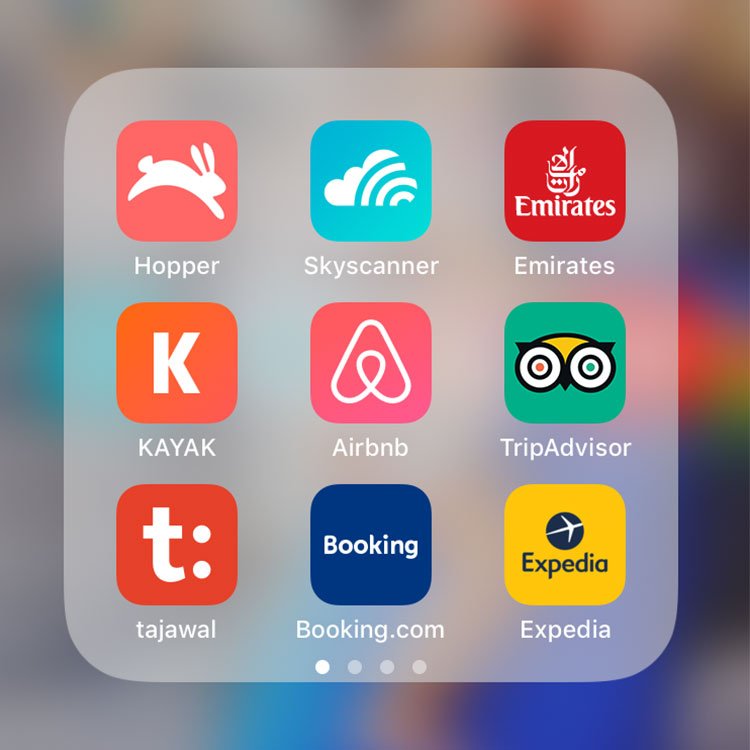
Analysis of the competition is carried out to determine what the trends are within the sector, and what successes and mistakes our rivals are making.
Again, we divide the research into four parts from a list of competitors we have previously selected, giving each member the freedom to include more if they feel it is useful.
After this analysis, the team extract the strongest and weakest points of our competence to use them to our advantage. Understanding your competition enables us to ensure we don’t make the same mistakes and we can improve the parts where they are already succeeding.
Survey & interviews
We prepared a survey of ten questions with which we will try to resolve most of the pain-points of our users. The survey would be presented face-to-face and also online to ensure our data gathered would be impartial and users would come from a broad spectrum of users.
The team had managed to obtain more than 150 answers, which were analysed to obtain the following insights:
- 67% of those surveyed are between 18 and 39 years old
- The majority travel 2 or more times a year
- 37%of those surveyed travel for work
- Around 69% travel for leisure mainly as a couple or family
- For leisure travel, participants usually decide of a destination and look for offers
- 92% search their trips online, either via web or app.
With the data collected, we formulate new questions for face-to-face personal interviews, each team member will conduct eight, based on the average user profile given by the survey data.
During the interview, we directed our questions first to create a rapport with the user and then targeted the pain-points. We manage to extract more specific insights from each user by making it clearer to us the way to follow in our possible solution.
MosCow & Wireframes
After data was analysed, we needed to ensure the team worked of features that highlighted the user ‘pain points’ as ‘must haves’, we did this by using the MosCow method. Using this method, we determined which of the features will be important and which will not be so relevant.
Allowing the team to prioritise the features the app will have in order to offer the user the tightest possible solution.
Once this research is completed, we began shaping the app. We created an MVP (Minimum Viable Product) of our app to validate it with users, which allowed us to iterate it and make it better with each new version.
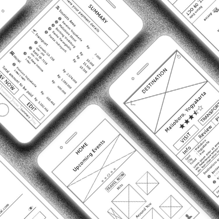
We conducted the user testing from using low-fidelity wireframes (black & white), mainly to help us represent a general idea of our future solution of an app, once we were able to get more insights, the team created high-fidelity wireframes, where layout & colour are tested.
Once we were happy with the MVP, we continued to polish the design to assure the design matched what users needed and to help the business understand their users more.

User Testing
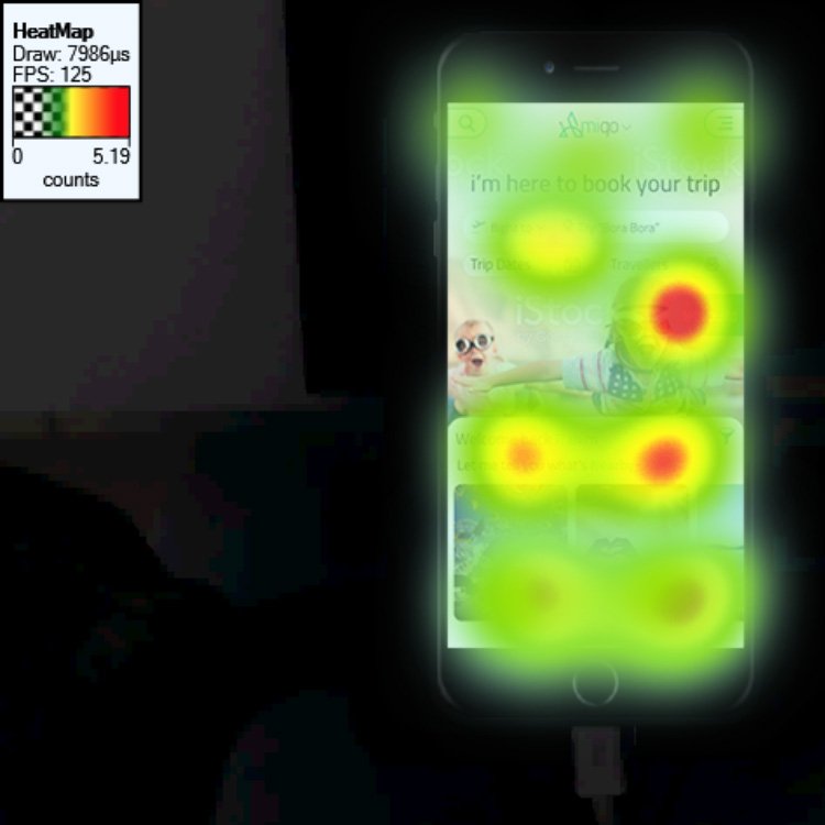
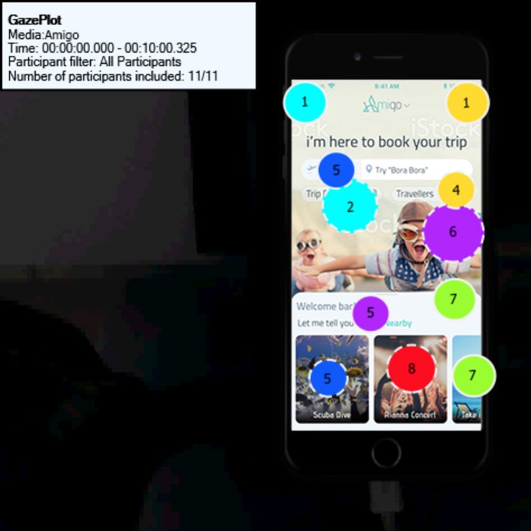
We had invited users from different ages & demographics to test the app throughout the process from wireframes to the final build process. We wanted to conclude the app as well as finalise the development on how they interact and how they consumed the data.
On the final version of the app, we invited a few more users to complete the build. The insights we gathered further helped the team to polish the final build of the app, we re-evaluated some of the assumptions made during the app lifecycle.
The Result
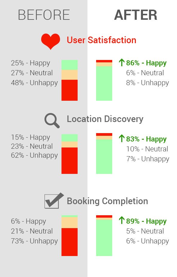
We ran over 25 task tests to assess the impact on user satisfaction. We measured the performance of the new design over key areas:
- Discovery (users can find they are looking for)
- User Engagement (users can find and book holidays)
- Satisfaction (how happy users are using the app)
In our experience when re-vamping a website/app, users typically experience a time of adjustment to be able to find the things in their new place.
Having maintained a very high level of task discovery, in spite of a completely new design, which normally would lead to a drop in discovery (adjustment period). We found that user found the new design more intuitive and easy to book.
Completion: no more friction
After the redesigned website/app was tested, we noticed users were no longer getting lost while trying to find locations as well as share the information with others. During our testing sessions, users we smailing more due to to the tone of voice and the location details, we also found users were more inclined to book a location as well as when further and flights too.
Satisfaction: no more frustration
User were happy to share their location and read location information, furthermore, we found users found the rating really helpful especially when booking for families.
Conclusion
The objective was to wow the users and help users to find new locations, engage them to share locations with friends and family as well as finally book their holidays.
From the task analysis, we can say they were delighted with the new app.


