The Challenge
The Dubai Driver app from RTA is created to be the road users companion, this means it should help users conduct all services related to a driver and their vehicles.
Which over 120 related services, the app was not simple to use nor was it simple to find the service a user needs quickly, this let to a few frustrations from having to go to a happiness centre to complete necessary tasks.
Initial interviews with users shed some light on the fact that the app was more of an online catalogue of the services then one which could help them complete the desired task.
The Breif
We were to create a ‘best of breed‘ application for mobile and tablets that would provide; the highest performance levels, improve services, increase user adoption and follow global mobile standards.
To fulfil the brief, we worked together with RTA, to strategise the following:
-
- Delight users with a clean, innovative and simple app experience
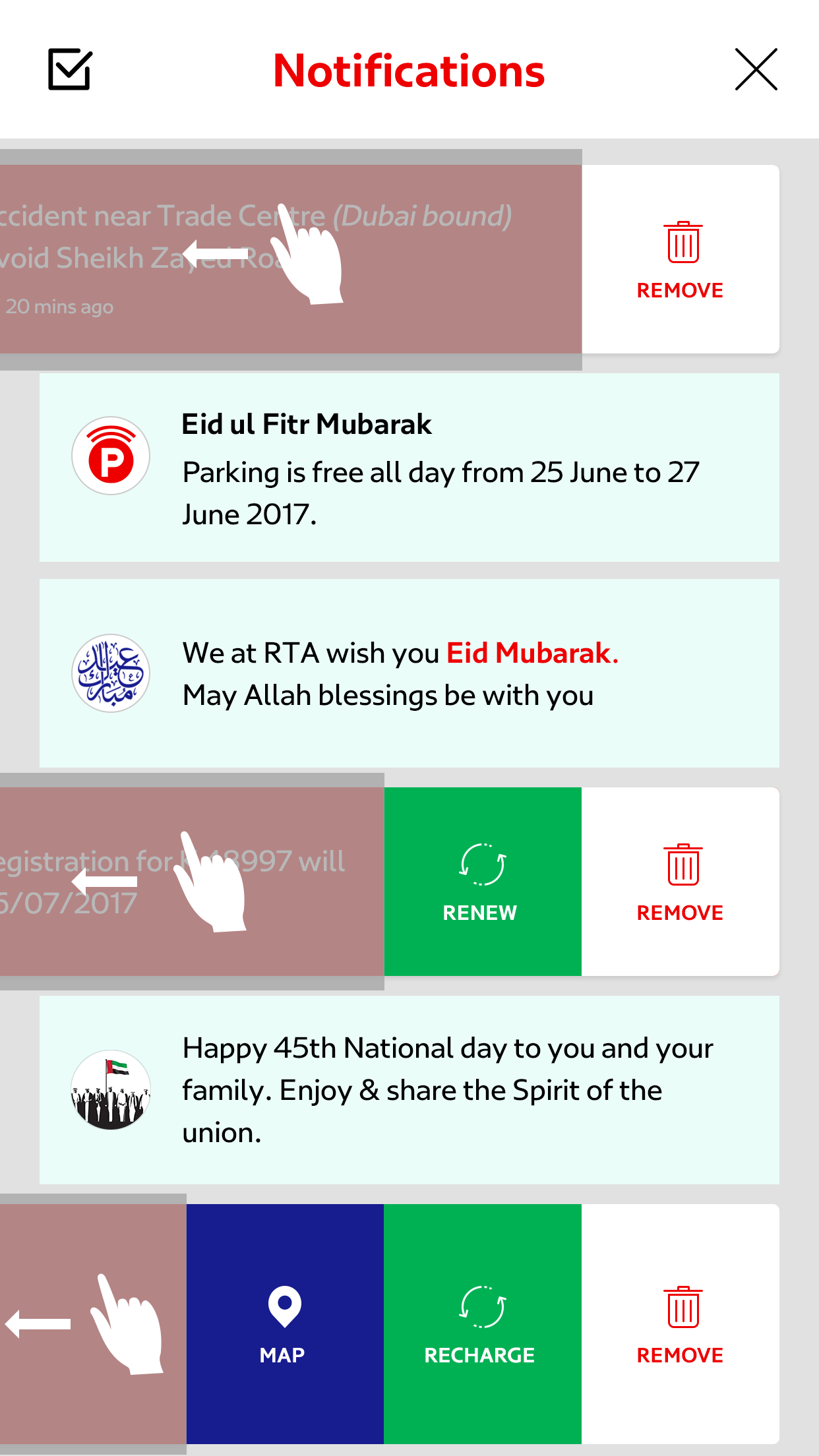
- Adopt a new design which would encourage users by cross-selling services
- Device a ‘tone of voice’ for all touch points from app to in person
- Assure a multi-channel experience from mobile, kiosk to face-to-face interactions


The Research
To create a ‘best in class’ application, we needed to research the global trends for mobile apps as well as located apps that have provided delight to its users.
We begin with having stakeholder interviews, just to understand the full picture of what ‘pain points’ the business knew of. It became evident that we needed to refactor the number of services into specific groupings.
We needed to group them in a way that users use their services, ensuring the name conversions used resonated with the end users. We also needed to ensure these groupings made business sense, as we would also need to train the call centre as well as other agents on ‘the ground’.
The Method
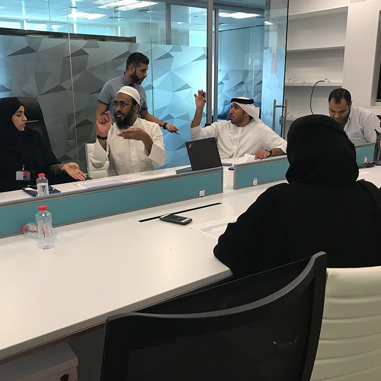
As one team began working with researching, another team began conducting user interviews, card sorting exercises and focus groups, mainly to find what they felt regarding RTA service both online and offline as well as finding ‘service grouping’ that resonates with users.
The data collected would help our team engineer and provide the RTA team on focusing on the ‘user pain points’ and together find solutions to those.


Insights
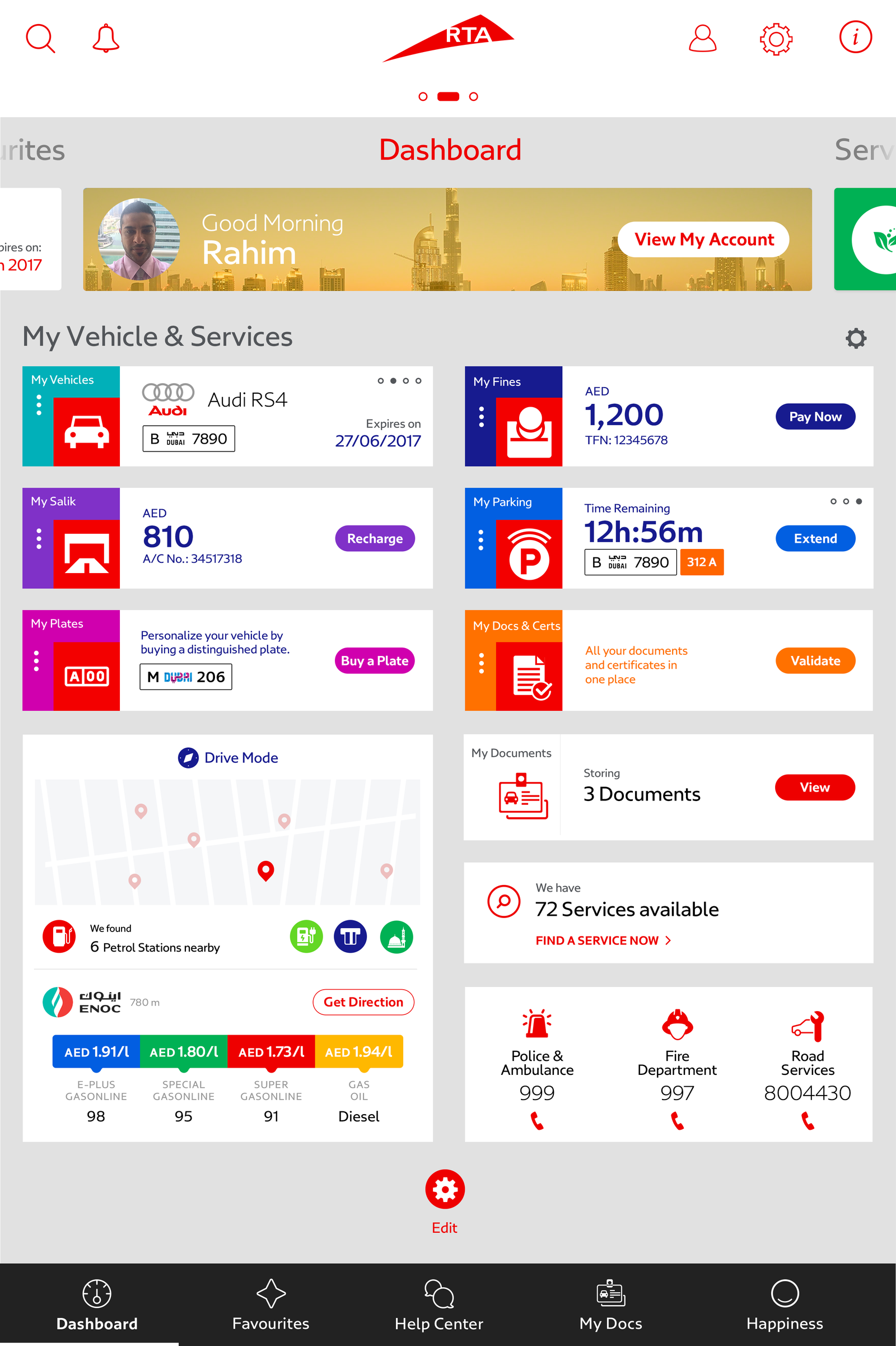
One of the foremost insights we gained was the need for multiple services, this meant that we needed to design something that would provide users with a ‘360 view’ at a glance around their vehicles, and fines and balances.
From the ‘card sporting’ exercise and user testing using ‘Tobii’ glasses, we were able to gather valuable understandings of the group names, they understood and how RTA users target services they needed on a daily, monthly and yearly basis.
Sketching & Wireframes


User Testing
Users were invited at different stages on the design & development phases from a cross-section of the demographic. Users tested the app from wireframes to the final design of the app and in between.
We gathered all the data and analysed further, to find if there were tweaks we could make to improvements. We changed our team on the service enhancements and user flows. Over 20 testing sessions were held to assure the designs matched user perceptions and beyond. The RTA team also instructed us to compare the current live app to that of the new, to ensure all our findings were true and to help them understand further needs for the future.

The Result
We covered over 100 task tests to assess the impact of the app on user satisfaction and task completion. We measured the performance of the new design over key areas:
- Service Groupings (users can find they are looking for)
- User Engagement (users can complete a given task quickly)
- Satisfaction (how happy users are using the app)
In our experience when re-vamping an app, users typically experience a time of adjustment to be able to find the things in their new place and flows.
Having maintained a very high level of task completion, in spite of a completely new design, which normally would lead to a drop in service usage (adjustment period). We found that user found the new design more intuitive and easy to use and simpler to find other relates services.
Completion: no more friction
After the redesigned app was tested, we observed users were no longer lost, they were able to find services quickly, and the new dashboard was working really well. Users were shown the most important data at a glace and this further emphasised the need for the redesign.
Satisfaction: no more frustration
We were able to see a marked improvement in the number of services users engagement with. Furthermore, we were also pleased with the number of users who registered and begin to personalise and use the app more frequently.

Conclusion

The objective was to delight users, to aid in finding and completing services with speed and precision. As our analysis has shown this has been executed and we believe RTA users would be happy with the outcome.
It also must be noted, when it comes delighting users, animation plays a big part. Users no longer have the patience to wait for a screen to load, but if they have something that tells them what is currently happing then they are happier but this also has a limit, normally 3 seconds.


