The Challenge
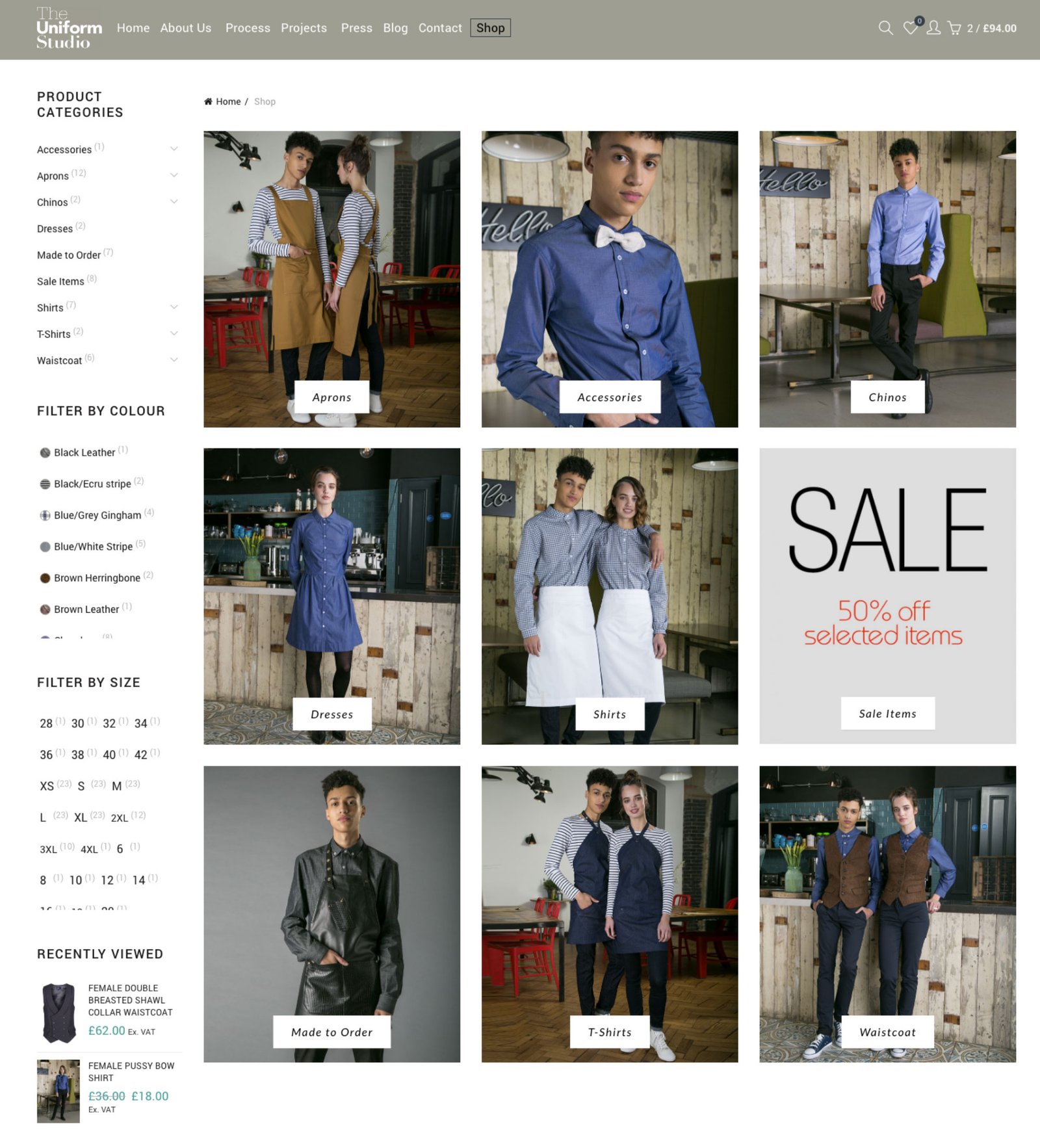
We were commissioned to design their online brand & website. Their main focus is to design practical and stylish bespoke staff uniforms for the apparel & fashion industry. They have designed bespoke staff uniform collections within the hotel, restaurant, retail and events industries.
Our sole aim to help them transpose their ideas and design thinking onto the web, showcasing their creative outlook and assist their customers to create a uniform that matches their clients’ ideology.
The Breif
As we started this extensive project, the first step was to understand their users and their pain points, their motivations and the tasks they wanted to perform, the way they liked to perform. We also needed to look into how currently they fulfill their tasks and the apps they use.
This became the foundation of our strategy, the management asked us to focus on the following:
-
- Delight customers with an efficient, hassle-free and simple experience
- Use customers pain points to design a more intuitive website
- Device a ‘tone of voice’ for all touch points from website to ‘in person’ dialogue
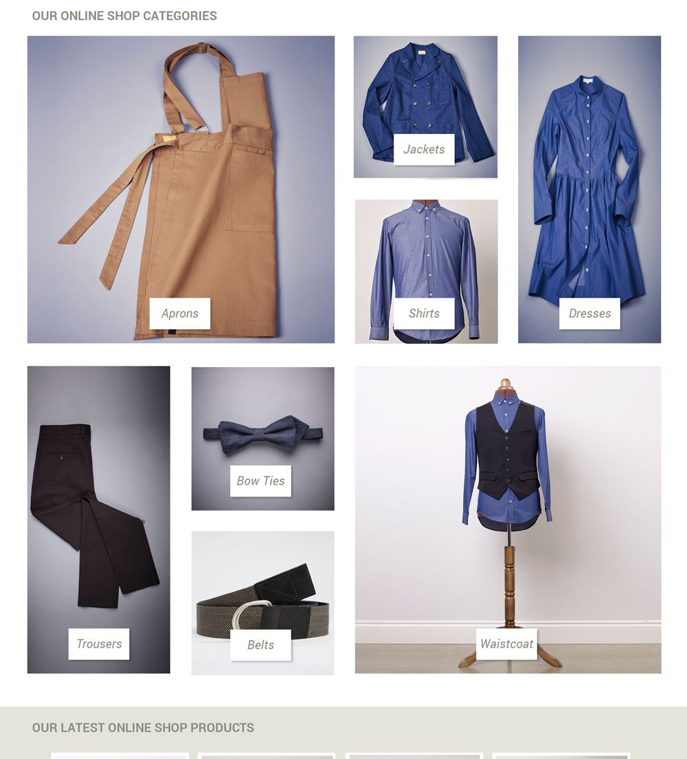
- Showcase their uniform designs as well as give users the chance to purchase ‘off the shelf’ uniforms.


User research
Out first ‘point of call’ was to understand their clients, how they select a uniform design team and discussed their pain points. We analysed their motivations, the tasks they wanted to perform, how they perform them and how they felt after.
We try to uncover a deeper understanding of their users, by conducting surveys, focus groups, user interviews as well as the data shared by The Uniform Studio. These included all CRM cases and online sentiment towards them.
Some of the data we gathered was compelling e.g.
- 90% look to fashion brands to understand the user trends
- 88% look online for uniform companies internationally
- 73% of clients visited high-end restaurants to view staff uniforms
- 67% were frustrated with options provided by uniform companies
Global & local benchmarking
The second part of our research, we benchmarked against global and local companies catering to the apparel & fashion sector. We looked at their services, such as bespoke designs, ‘off the self’ uniforms as well as the number of options they provided and the costs involved.
This rendered the middle layer of our strategy, were we collated the business and sector demands, service gaps and their related issues. To provide a solid foundation for the new strategy we need to understand what the current market has been offering and analysing their individual pain points, so as not to make the same errors for the future.

User persona’s
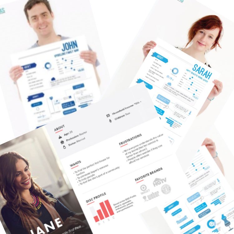
At User Centric, our persona’s are a representation of a user, based on user research and incorporating user goals, current behaviour, pain points as well as their interests. They are based on field research and real people.
We curated a story and describe why this persona does what they do in an attempt to help everyone involved in designing and building the product. We use the persona as a guide throughout the entire product development process.
Due to the variation of the user types, we needed to create personals related to the user demographics, age, and business maturity levels. This created an issue for us, normally creating a persona helps UXers group and reduce user types, however, we were left with over 6 personas from all the data we had gathered.
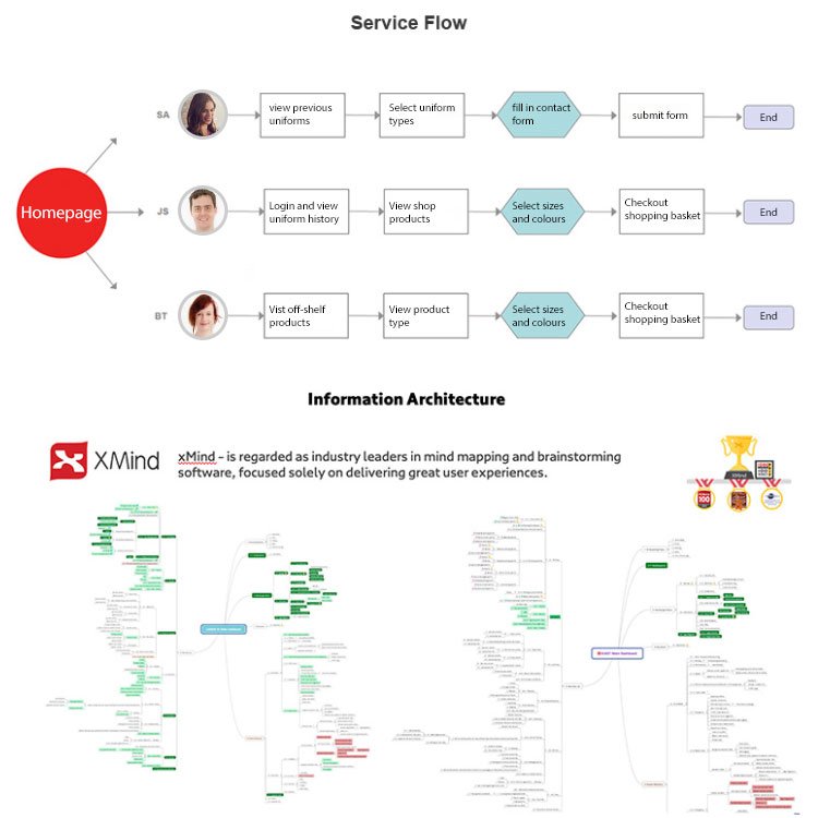
We were not able to reduce them further so we got to work with creating user flows by persona. These mini-stores would help us answer each pain point in turn, for each persona and put together the UX design and user flows.
Deeper Insights
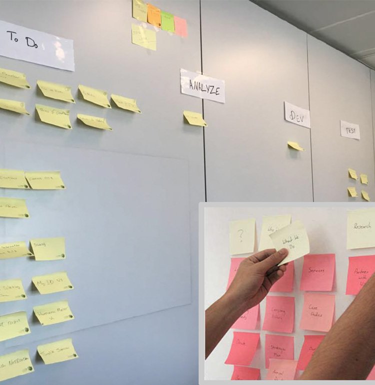
The final part of our research, we collect all research gathered from the stakeholder interviews, user interview & surveys as well as the benchmarking and collating them into a formalised document.
We target each persona and their pain points, likes and dislikes, to formulate possible solutions addressing their needs which we believe would foster deeper loyalty to the business.
Finally, we look into realms of “what if’s”. This is where we look at the global omnichannel experience, the innovations that are gleaned and the impact they have on users loyalty.
This document would be the bedrock of our strategy which we then share with the business for their buy-in.
Wireframing & User flows
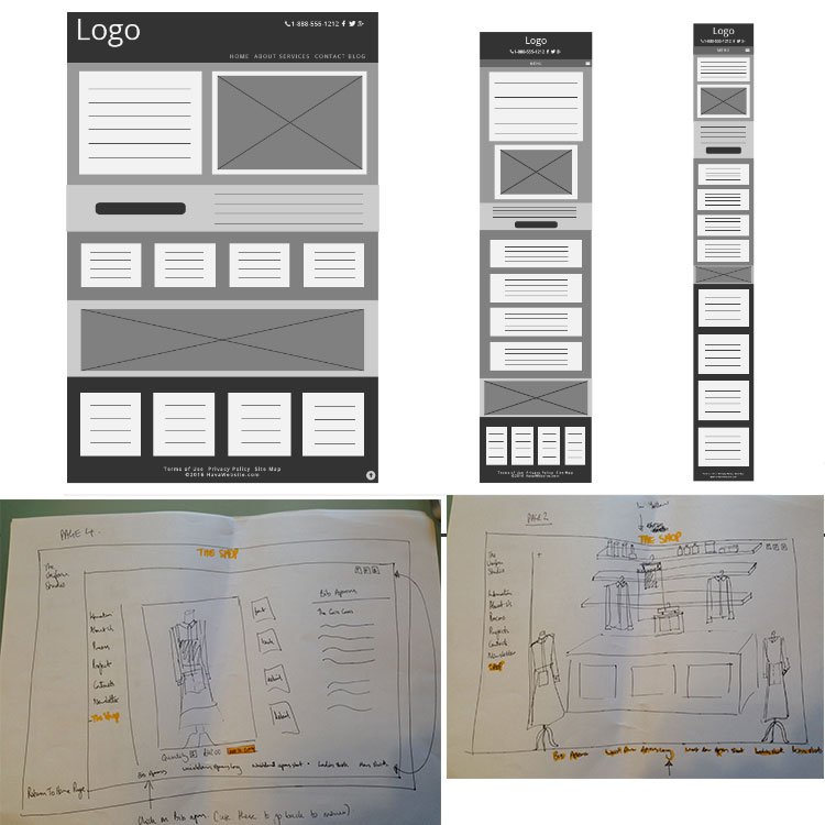
The team created wireframes starting from the homepage onto the services & the shop using the persona we had curated. For each screen, we divided the team into groups of 2, where one member would work on a screen and the other team member would work on another version of the same screen.
We would then continue in the same vein to create the full flow from the dashboard (homepage) onto the individual services creating a consistent user flow. When a service is completed, we used these to conduct A/B testing and rate each screen and flow on their merits.
Mainly looking at:
- Task completion rate from the test cases we had created
- Time taken to find & complete service/feature
- Evaluating screen flow and click rate
- Assessing user cognitive load as they move from screen to screen
User Testing
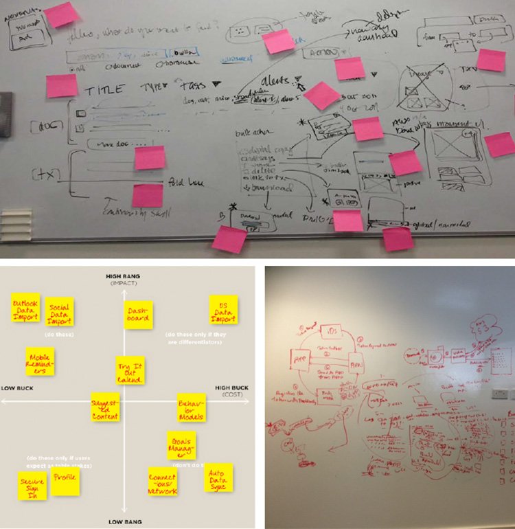
Completion of all wireframes means its time to begin putting together tappable prototypes with a flow from screen to screen and also navigation within the app. The main idea here is to confirm all our understanding of the data we collected, answering all pain points and more importantly continuing the A/B testing to:
- perceive any movement on service findability & completion
- collect data on screen flow and users abandonment
- use “Tobii” to track users and collect heatmap & gaze points
- examine via “talking out aloud” method where users communicate via voice as they navigate through the app
- annotate task completion rates and flows
All the data collected would provide the team with direction on screens, flows and if any need further enhancements as well as those that would be sent to the graphic design team for branding, UI and copywriting.

The Result
We covered over 30 task tests to assess the impact on user satisfaction and task completion, measuring the performance of the new design over key areas:
- Discovery (users can find what they are looking for)
- User Engagement (users were able to complete tasks i.e purchase a garment)
- Satisfaction (were they happy with the website)
In our experience when re-vamping a website, users typically experience a time of adjustment when trying to find the things in their new places. However, the new design has improved user experience, in spite of a completely new design, which normally would lead to a drop in discovery (adjustment period). We found that user found the new design more intuitive and easy to use.
Completion: no more friction
After the redesigned app was tested, we noticed the following:
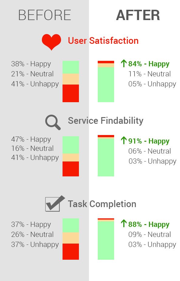
- 91% of users found the service or feature they were looking for
- 88% were able to complete their tasks within 5 mins
- only 3% abandoned one of their tasks (mainly product purchasing)
- 84% of user felt happy after completing a task
Satisfaction: no more frustration
We were able to see a marked increase in the number of users completing tasks and trying other related services on the website, such as viewing other uniforms previously created, making payments and showing an increase in deeper interaction and time spent on the website. Furthermore, we were also pleased with the number of users who registered and begin to personalise the website.
Conclusion
The 2 main objectives of the project were:
- Facilitate clients to create accounts with a history of their purchases.
- Increasing the consummations of multiple services and increase on repeat visits.
- The ability for clients to find ‘off-shelf’ products and have them pay for them online
Within 3 months of the revamped app going live, The Uniform Studio has noticed an upturn on the number of transactions and their total value, the return rate of users who visit the app 3.1 visits per day, as well as 60% of users personalising the website to their needs.

